Our agency began in 1974 in response to a serial rapist in the Athens area. Dedicated Athens area activists established the Athens Rape Crisis Line and volunteers worked around the clock to respond to the threat. It was the first anti sexual assault organization to form in the state of Georgia and a founding member of the Georgia Network to End Sexual Assault.
In 1985 the Athens Rape Crisis Line became the Rape Crisis Center of Northeast Georgia and in 1990, fortified with federal funding from the Victims of Crime Act, the Center relocated to its current location behind the Athens Clarke County Police Department.
In 1998 the center underwent another name change to be inclusive of all survivors of sexual violence and became the Sexual Assault Center of Northeast Georgia.
In 1990 the name was changed to The Cottage Sexual Assault Center and Children’s Advocacy Center to denote the agency’s full mission and to associate the organization with the little blue cottage that houses it. A logo was created that featured green leaves in a circle, symbolizing the change and growth that comes from healing.
This year a team of The Cottage staff and board members worked with marketing firm Rock Paper Scissors to create a new logo. We wanted our brand to be recognizable, and the symbolism to show what we do and the promise it represents.
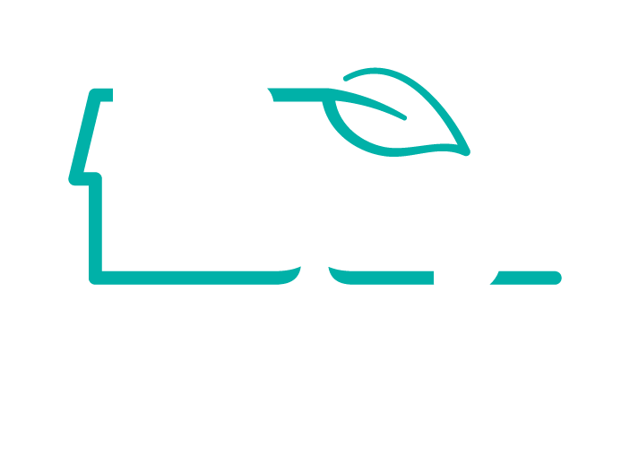
We chose navy blue and teal because they are the colors of child abuse prevention and sexual violence prevention and awareness. We wanted to carry over the symbol of a leaf for the change and growth it represents as well as to incorporate the outline of the building where so much healing takes place.
At our annual Friends and Family Open House, Stephanie Rountree, the president of our board of directors, said of the new logo: “It was essential to us that our logo reflected who we are and what we’re known for. Our building is iconic. It’s also a precious space of safety, healing and well-being and we wanted it to be integral in our logo. We also wanted to make sure that we honored and continued the legacy of the leaf and the theory that out of very many we make a strong opportunity for growth and change, and for protection. We also wanted it to reflect a place that is welcoming, so you’ll notice that between the two t’s create a doorway that invites anyone through our doors…anyone from any place, anywhere, you have a place here: this is where you can find healing, this is where you can find advocacy.”
As we continue to provide a space for healing and advocacy for survivors in our community, to walk with them on their healing journey, our new logo will be a symbol of that hope and that
promise. It will be a beacon to those in need and depict our belief that every person deserves the chance to heal, to have advocacy and care through the process, and to know they are loved, understood and not alone.